The Art of Refreshing a Logo

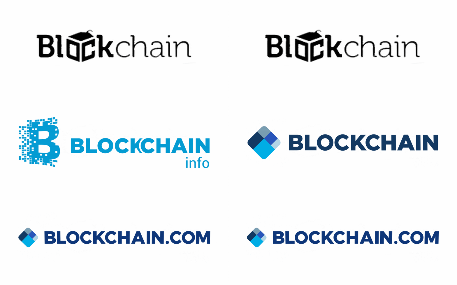
Blockchain.com has evolved rapidly over the past few years, stemming from a small data-focused website to the most trusted crypto platform with millions of users around the world. As the company has changed, so has our look and feel. We’ve undergone a few logo and brand refreshes to meet the needs of the ever-growing crypto space and most importantly, our users.
Working with a talented team of in-house designers, we created a fresh look that was approachable, modern, and UI friendly. A keen eye might have noticed that over the past year, we’ve been quietly polishing various aspects of our brand.

Did you notice?
Back in early 2019, we updated our font from a combination of Montserrat, Futura and Gill Sans to Inter across all product and marketing (and we haven’t looked back). We made the shift for a couple reasons:
Montserrat
- Didn’t support monospace
- Has hard to read numerals, which for number heavy interfaces like Explorer, Exchange and Wallet was far from ideal
- Is wider than most typefaces, taking up valuable space in places like data tables
Inter
- Has impressive legibility, designed for digital screens
- Has extensive glyph support
- Supports monospace for data heavy UIs
We also improved our color palette by increasing saturation and brightness to our blues, creating a more electric and dynamic feel. The muted, inactive and sometimes pastel tones we had before no longer lined up with the direction the company is headed. On top of that, we expanded our secondary palette to include a full set of colors, which allows us the flexibility to be more creative when experimenting and developing new designs.
Blockchain…I think I’ve heard of it
One problem we faced as a company was the confusion between Blockchain the company and blockchain the technology, especially from those unfamiliar with crypto. In order to differentiate our brand from the tech, we changed our name to Blockchain.com (you can read a more in depth explanation here). In terms of the logo and wordmark, we kept it mostly the same for recognizability, adding a ‘.COM’ at the end. This was a simple solution for a much needed brand distinction.
So why’d you change it again?
While we love the name and new identity, it did create an unusual challenge for us. The added real estate of the ‘.COM’ expanded the width of the wordmark, making it difficult to place within certain situations across product and marketing while maintaining readability. The all caps also felt outdated and chunky, and the logo itself contained colors that we were no longer using in our palette. It was time for a refresh.
The process
At first, we mused over how in-depth we wanted to go. Attack only the wordmark? Update the logo colors to our new blues? Scrap it altogether?
We had a team meeting to discuss possible solutions, and knew the quickest fix was to move to initial caps to save much needed space and match the wordmark to our Inter font. This improved readability, since people tend to read the shape of a word rather than individual letters — which is hard to differentiate with an all caps wordmark.
But why stop there?
With our previous refreshes and recent update to our company core values, it was high time we had a full redesign of our logo to match. And so began our first design sprint.
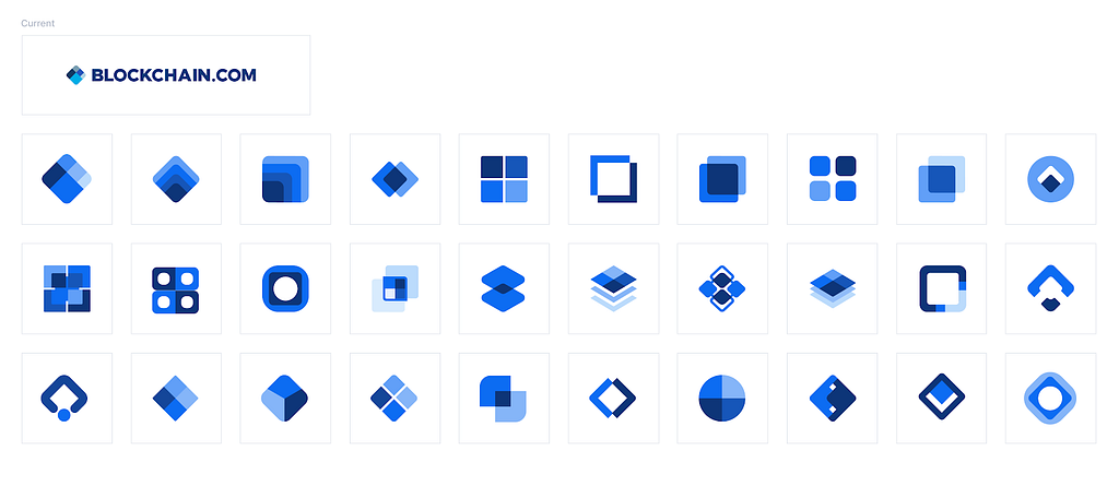
Before the coronavirus hit, the design team was already dispersed across multiple timezones and was very comfortable working remotely with one another. We had a design session where we threw any and all ideas into a Figma file (a very effective whiteboard substitute). It was surprisingly just as productive and creative as an in-person meeting. Below are some of the rudimentary experimentations we came up with.

We all came together after this and had a general review. What, if anything, stood out to us — for good or bad reasons — and what can we draw from it? What if we change the rounding here, or increase line width there, or change the color of this shape? And maybe more importantly, does this look like an already existing logo?
After some musing, this design was initially chosen for further exploration:

We liked the illusion that the intersecting shapes created, masked within our well-known diamond shape. Some people saw a cube, while others saw a birds-eye pyramid. Whichever way, it made the viewer pause for a moment and take a second look.
Once we had our selection, we went back to the drawing board (Figma file) and tried out different iterations of the above, seen below:

We found that less rounding = sharper corners and a more serious/sharp tone from the shape, while more rounding = friendlier and more open. Being an approachable brand, we decided more rounding was probably better than less.
This logo iteration also needed more definition — we wanted to hold on to the illusion the initial design had, but also felt the colors blended into each other too much. We solved this by creating a simple outline of the shapes.

Okay — not bad. Next was to see how it stood up to in-situ mock ups. We placed it in navigation bars, app store download pages, research papers, and social channels. And although we liked what we saw, one discernable problem was that the light blue left ‘corner’ felt too light and was difficult to see against a white background, especially when seen at a small scale.
So after some experimentation with color, we settled on a selection of our blues that moved in increments of 200, based on our blue 000–800 palette. We found the result below worked best on most brand colored backgrounds.

The next step was to make the logo pixel perfect and place it with the wordmark. We set the dividing line between the shapes to be 1px and then defined the spacing between the logo and the wordmark based on that width.

Finally, when taking a step back and looking at our wordmark with our logo, we decided the main focus should be Blockchain, with a lighter emphasis on the ‘.com’. We experimented with different opacities and colors, and found that our Grey 300 worked best on all on-brand colored backgrounds.
With a little After Effects magic, the end result:

Why we like it
When we embarked on this journey, it was important to pay homage to the previous logo. Our original diamond shape denoted a block within the blockchain, and we wanted to replicate that core motif in this refresh. With this rendition, there’s still the block-like feel but with a cleaner and more modern touch. It’s also a simple enough design that anyone could glance at it and draw it themselves.
When designing the new logo, we wanted it to be flexible enough to grow with the brand for years to come. While the symbolism remains the same, it is a simple shift from the old to the new — a change of perspective. This movement is something we wanted to capture within the new design and kept this in mind when creating the logo animation as well.
Special Thanks: Design team
Thianh Lu
Rosana Castano
Greg Christian
Mikael Keussen
Bettsina Walkinson
Sydney St. Clare
More from Blockchain.com:
https://dribbble.com/Blockchain
https://www.instagram.com/blockchainofficial/
https://twitter.com/blockchain
https://www.linkedin.com/company/blockchain/
The Art of Refreshing a Logo was originally published in @blockchain on Medium, where people are continuing the conversation by highlighting and responding to this story.


